Wildfire Geospatial Analysis in Australia
Geospatial data analysis and dashboard to understand the behavior of wildfires in Australia.
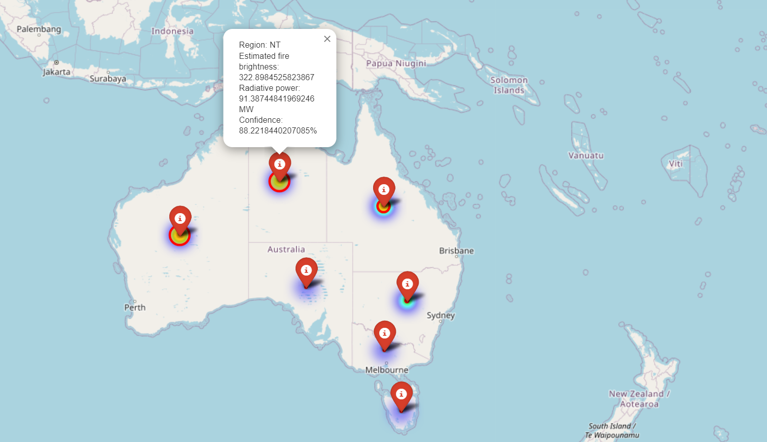
🗺️ Interactive Map of Wildfires in Australia
This map shows the distribution of wildfires across Australia. Use the interactive features to explore different regions and data points.
🛠️ Tools and Technologies Used


📊 Exploratory Data Analysis (EDA)
In this project, extensive exploratory data analysis was performed to understand the behavior and impact of wildfires in Australia. Key visualizations included:
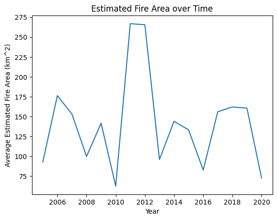
1. Estimated Fire Area Over Years
- A line chart visualizing the trend of average estimated fire area over the years, providing insights into the frequency and severity of wildfires.
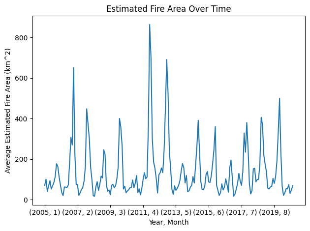
2. Estimated Fire Area Over Time
- A detailed line plot to analyze the average estimated fire area over time, highlighting seasonal variations and year-to-year changes.
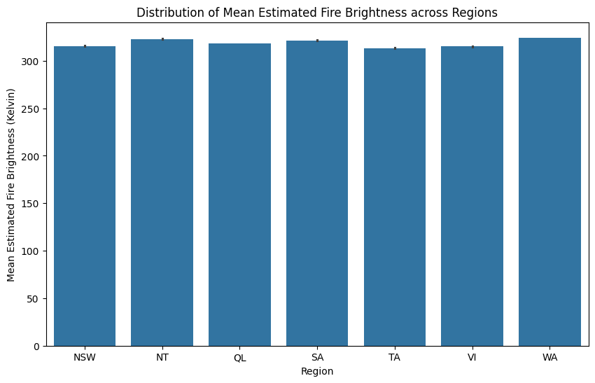
3. Mean Estimated Fire Brightness Across the Regions
- A bar plot showing the distribution of mean estimated fire brightness (Kelvin) across different regions, indicating variations in wildfire intensity.
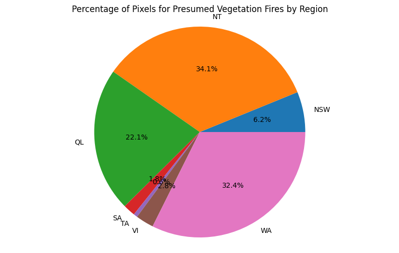
4. Fire Pixels by Region
- A pie chart illustrating the percentage distribution of pixels associated with presumed vegetation fires across various regions.
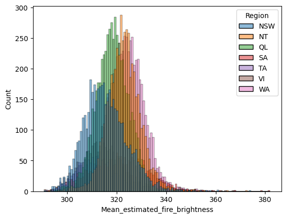
5. Histogram of the Mean Estimated Fire Brightness
- A histogram displaying the distribution of the mean estimated fire brightness to analyze the frequency and intensity of wildfires.
sns.histplot(data=df, x='Mean_estimated_fire_brightness', hue='Region')
plt.show()
🌍 Geospatial Analysis
- An interactive map was created using Folium to visualize the geographical distribution of wildfires across Australia. This map allows for a spatial understanding of wildfire patterns and hotspots, making it a powerful tool for analysis.
🌐 Dashboard
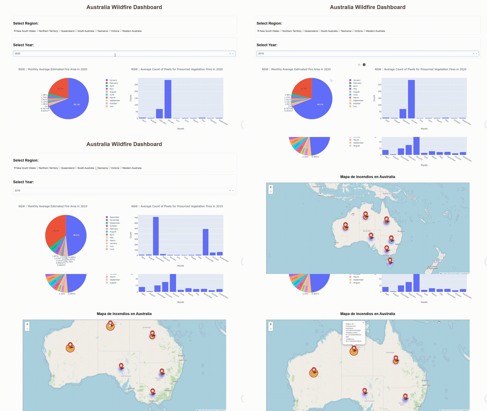
An interactive dashboard was developed using Dash and Plotly, enabling users to explore wildfire data dynamically. The dashboard features:
- Region and Year Selection: Users can select specific regions and years to visualize wildfire data.
- Monthly Average Fire Area: A pie chart showing the average fire area per month for the selected region and year.
- Monthly Fire Pixels Count: A bar chart displaying the average count of pixels for presumed vegetation fires by month.
